Children’s books are more than just stories; they are powerful tools that shape young minds and help them make sense of the world around them. The illustrations and colours used in these books play a crucial role in capturing children’s attention, evoking emotions, and conveying messages that can leave a lasting impact on their development. Colour psychology, the study of how colours affect human emotions and behaviour, is particularly relevant in the context of children’s books. By understanding the psychological effects of different colours, authors, illustrators, and parents can create and choose books that not only entertain but also support children’s emotional, cognitive, and social growth. This article delves into the fascinating world of colour psychology in children’s books, exploring how colours influence young minds and discussing the importance of mindful colour choices in children’s media.
The Basics of Colour Psychology
Colour psychology is a complex field that examines the ways in which colours can impact our emotions, perceptions, and behaviours. Each colour has its own unique psychological properties that can evoke specific feelings and responses in individuals. For example, red is often associated with excitement, passion, and energy, while blue is linked to calmness, trust, and stability. Yellow is known for its ability to stimulate mental activity and promote happiness, while green is often associated with balance, growth, and harmony. Understanding these basic colour associations is essential for creating effective and meaningful colour palettes in children’s books.
However, it is important to note that colour perception can vary across cultures and individuals. What one culture associates with a particular colour may differ from another, and personal experiences and preferences can also influence how individuals respond to colours. For example, while white is often associated with purity and innocence in Western cultures, it is linked to death and mourning in some Eastern cultures. As such, it is crucial for authors and illustrators to be mindful of cultural differences when selecting colours for their books.
Colours and Their Psychological Effects on Children
When it comes to children’s books, the psychological effects of colours can be particularly pronounced. Children are highly sensitive to visual stimuli, and the colours used in illustrations can greatly influence their emotional responses and overall engagement with the story. Let’s take a closer look at some of the most common colours used in children’s books and their psychological effects on young readers.
Red is a powerful colour that can capture children’s attention and create a sense of urgency or importance. It is often used to highlight key elements in illustrations, such as a character’s clothing or an important object. However, overuse of red can be overstimulating and may lead to feelings of aggression or impulsivity. In the beloved classic “The Very Hungry Caterpillar” by Eric Carle, red is used sparingly but effectively to emphasise the caterpillar’s voracious appetite and the juicy apple he eats.
Blue, on the other hand, is a calming and soothing colour that can create a sense of security and stability. It is often used in bedtime stories or books that aim to promote relaxation and tranquillity. “Goodnight Moon” by Margaret Wise Brown is a perfect example of how blue can be used to create a peaceful and comforting atmosphere. The book’s illustrations feature a soft, muted blue palette that helps lull young readers to sleep.
Yellow is a bright and cheerful colour that is often associated with happiness, optimism, and mental stimulation. It is a popular choice for children’s books that aim to encourage creativity and imagination. “The Yellow Book” by Herve Tullet is a prime example of how yellow can be used to engage young readers and promote interactive learning. The book’s vibrant yellow pages are filled with simple shapes and instructions that encourage children to explore and create their own artistic designs.
Green is a colour that represents balance, harmony, growth, and nature. It is often used in children’s books that explore environmental themes or encourage personal development. “The Giving Tree” by Shel Silverstein is a classic example of how green can be used to symbolise the enduring love and generosity of nature. The book’s illustrations feature a lush green tree that provides comfort and support to the boy throughout his life.
Purple is a colour that is often associated with creativity, imagination, royalty, and luxury. In children’s books, purple can be used to create a sense of magic and wonder, transporting young readers to fantastical worlds filled with endless possibilities. “Harold and the Purple Crayon” by Crockett Johnson is a beloved classic that celebrates the power of imagination. The book’s protagonist, Harold, uses his purple crayon to draw his own adventures, showcasing the limitless potential of a child’s creativity.
The Role of Colour in Children’s Book Illustrations
Colour plays a vital role in bringing children’s book illustrations to life and enhancing the overall storytelling experience. By carefully selecting colours that complement the story’s tone and theme, illustrators can effectively convey emotions, set the mood, and guide young readers through the narrative.
One of the primary functions of colour in children’s book illustrations is to enhance story comprehension. By using colours strategically, illustrators can highlight important elements, differentiate between characters, and create visual cues that help children follow the plot. For example, in “The Cat in the Hat” by Dr. Seuss, the titular character’s distinctive red and white striped hat and bow tie make him instantly recognizable and help children keep track of his antics throughout the story.
Colour can also be used to evoke specific emotional responses in young readers. Warm colours like red, orange, and yellow can create a sense of excitement, energy, and happiness, while cool colours like blue, green, and purple can evoke feelings of calmness, tranquillity, and mystery. By carefully selecting colours that match the emotional tone of the story, illustrators can help children connect with the characters and become more invested in the narrative.
In addition to enhancing comprehension and evoking emotions, colour can also be used to create visual interest and engagement in children’s book illustrations. Bold, contrasting colours can grab children’s attention and encourage them to explore the illustrations in more detail. Gradients, patterns, and textures can add depth and dimension to the artwork, making it more dynamic and engaging.
A great example of effective colour use in children’s book illustrations can be found in “Where the Wild Things Are” by Maurice Sendak. The book’s illustrations feature a muted colour palette during the scenes set in Max’s bedroom, reflecting the mundane reality of his everyday life. However, when Max enters the fantastical world of the Wild Things, the colours become much more vibrant and intense, with bold hues of orange, yellow, and blue dominating the pages. This contrast in colour effectively conveys the shift from reality to imagination and helps immerse young readers in Max’s wild adventure.
Colour Choices in Children’s Book Illustrations
When creating children’s book illustrations, artists must consider several factors in their colour choices to ensure that the artwork is age-appropriate, inclusive, and meaningful. One of the most important considerations is selecting colour palettes that are suitable for the intended age group. Younger children tend to be more attracted to bright, primary colours, while older children can appreciate more nuanced and complex colour schemes. By tailoring the colour palette to the target audience, illustrators can create artwork that is both visually appealing and developmentally appropriate.
In recent years, there has been a growing emphasis on creating gender-neutral colour schemes in children’s books. Traditionally, certain colours like pink and blue have been associated with specific genders, reinforcing stereotypes that can limit children’s self-expression and creativity. By using a more diverse and inclusive range of colours, illustrators can create books that appeal to all children. “The Day the Crayons Quit” by Drew Daywalt and Oliver Jeffers is a great example of a book that challenges colour stereotypes and encourages children to think outside the box.
Colour symbolism is another important consideration in children’s book illustrations. Certain colours can be used to represent specific emotions, ideas, or characters, adding depth and meaning to the story. For example, in “The Wizard of Oz” by L. Frank Baum, the yellow brick road symbolises the path to self-discovery and personal growth, while the green Emerald City represents the ultimate goal of Dorothy’s journey. By using colour symbolism effectively, illustrators can create artwork that not only looks beautiful but also contributes to the overall narrative and themes of the book.
Using Colour to Positively Influence Children’s Mood and Behaviour

Beyond the pages of children’s books, colour can also be used in children’s environments to positively influence their mood and behaviour. By incorporating carefully selected colours into children’s bedrooms, play areas, and learning spaces, parents and educators can create atmospheres that promote relaxation, creativity, and focus.
In bedrooms, using calming colours like blue, green, and lavender can help children wind down and prepare for sleep. These colours have been shown to lower heart rate and blood pressure, promoting a sense of tranquillity and relaxation. In play areas, incorporating vibrant colours like yellow, orange, and red can stimulate creativity and encourage active engagement. These colours are associated with energy, excitement, and enthusiasm, making them perfect for spaces where children are encouraged to explore and express themselves.
When it comes to learning spaces, using a balanced mix of calming and stimulating colours can help create an environment that is both soothing and engaging. Blue and green can promote concentration and focus, while yellow and orange can stimulate mental activity and encourage participation. By carefully selecting colours that support different learning activities and objectives, educators can create classrooms that are both visually appealing and conducive to learning.
Parents and educators can also use colour in creative ways to encourage self-expression and emotional intelligence in children. Colour-based activities and games, such as colouring books, painting projects, and colour scavenger hunts, can help children explore their feelings and develop a more nuanced understanding of colour psychology. By providing children with a wide range of colouring materials and allowing them to experiment with different colour combinations, adults can foster creativity and self-expression while also promoting emotional awareness and regulation.
Potential Negative Effects of Colour in Children’s Books
While colour can have many positive effects on children’s development and well-being, it is important to be aware of potential negative impacts as well. One concern is the risk of overstimulation and sensory overload, particularly in books that use a lot of bright, contrasting colours. When children are exposed to too many intense visual stimuli at once, they may become agitated, distracted, or overwhelmed, making it difficult for them to focus on the story or engage with the content in a meaningful way.
Another potential issue is the reinforcement of gender stereotypes through colour choices. Historically, many children’s books have relied on gendered colour schemes, such as pink for girls and blue for boys, which can limit children’s self-expression. By using more gender-neutral colours and avoiding stereotypical associations, authors and illustrators can create books that are more inclusive and empowering for all children.
Cultural insensitivity in colour choices is another concern, particularly in books that are marketed to a global audience. Different cultures may have different associations and meanings attached to specific colours, and what may be considered appropriate or appealing in one culture may be offensive or insensitive in another. For example, while white is often associated with purity and innocence in Western cultures, it is linked to death and mourning in some Eastern cultures. As such, it is important for authors and illustrators to be mindful of cultural differences and to do their research when selecting colours for their books.
Conclusion: Colour Psychology in Children’s Books
The psychology of colour in children’s books is a fascinating and complex topic that has far-reaching implications for children’s development and well-being. By understanding how colours influence young minds, authors, illustrators, and parents can make more informed and intentional choices about the books they create and share with children.
Colour has the power to enhance story comprehension, evoke emotions, and create visual interest and engagement in children’s book illustrations. By using colours strategically and mindfully, illustrators can create artwork that is both beautiful and meaningful, contributing to the overall impact and effectiveness of the book.
Beyond the pages of books, colour can also be used in children’s environments to positively influence their mood and behaviour. By incorporating carefully selected colours into bedrooms, play areas, and learning spaces, parents and educators can create atmospheres that promote relaxation, creativity, and focus.
However, it is important to be aware of potential negative effects of colour in children’s books, such as overstimulation, gender stereotyping, and cultural insensitivity. By being mindful of these concerns and striving to create more inclusive and diverse colour palettes, authors and illustrators can ensure that their books are both entertaining and empowering for all children.
As children’s media continues to evolve, it is essential to prioritise mindful colour choices that promote inclusivity, creativity, and well-being. By encouraging further research and exploration of colour psychology in children’s development, we can create a more vibrant and nurturing world for young minds to grow and flourish.
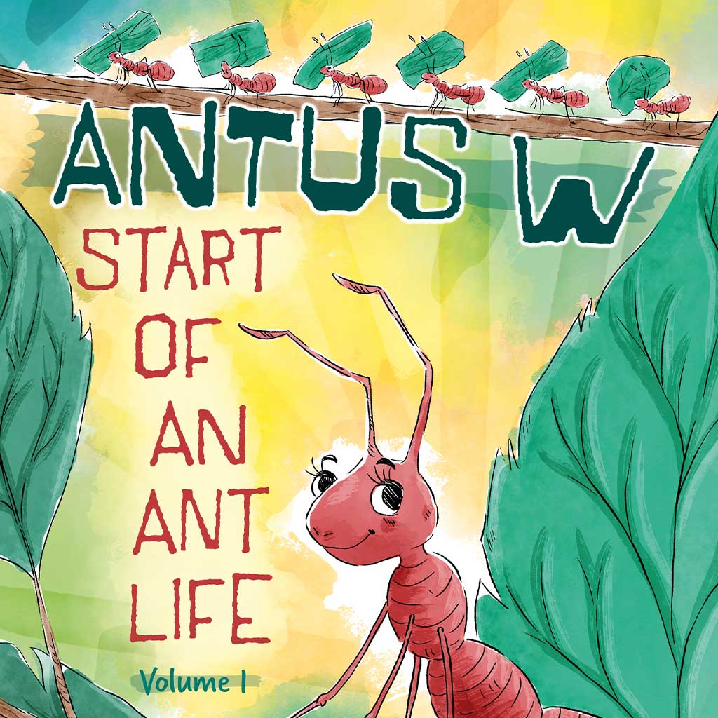
Bring your children’s book to life with captivating illustrations from Happydesigner, where imagination meets expertise.
Further Reading
- Colour Psychology and Its Role in Child Development – For an informative look at how colours influence children’s emotions and development, check out the article “The Color of Emotion” on Psychology Today. It explores how children associate different emotions with specific colours. You can read it on Psychology Today.