I have pondered and wondered over the Happydesigner site since it went live in january! I wanted something more than was already there and something just wasnt working for me the way I wanted it to!
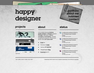
I then decided to redesign it based on the original design I managed to come up with this!! (what you are looking at) It just looks and behaves much more professional and sohowcases my work alot better than the original design does.
Also on a website, less is more I think! I tried to get too much work on the original and it just looked so crowded and ugly! So thanks to Tom Sinclair whom has helped me get this up and kicking!

